Saber Flutter UI
Problem and Motivation
As Innovation Labs, our engineers build a plethora of applications for proof-of-concept, for instance, web applications that are accessible from both desktop and mobiles or cross-platform mobile applications to achieve most of the device capabilities for end users.
The user interface is an essential part of every application that requires user interaction. For us, after we analyzed the timeline of each proof-of-concept we had done, nearly 45% of the time was spent on building user interfaces and prototype development which raised to us 4 major concerns as follows
- Time-consuming - it takes a lot of time to initiate a new application, whether it is a web or mobile
- Inconsistency - the UI components between pages of an application, we have to make sure that they are consistent throughout the whole application
- Maintainability - all the prototypes that were built should be kept updated to make sure it ready when the right time come
- Scalability - when too much time is spent initiating new applications and maintaining legacy ones, it’s difficult to focus on adding values for users
Solution
To address these concerns, we decided to develop reusable components with intuitive and well-designed user interfaces, that work cross-platform and comply with Material Design guidelines. We also provide multiple sample application templates, that are built on top of the components, so that developers can use them for bootstrapping an application faster. Moreover, sets of themes, colors, and typography are also available for easily composing and extending applications for particular use cases. This package is named “Saber Flutter UI”, based on Flutter, and is fully open source.
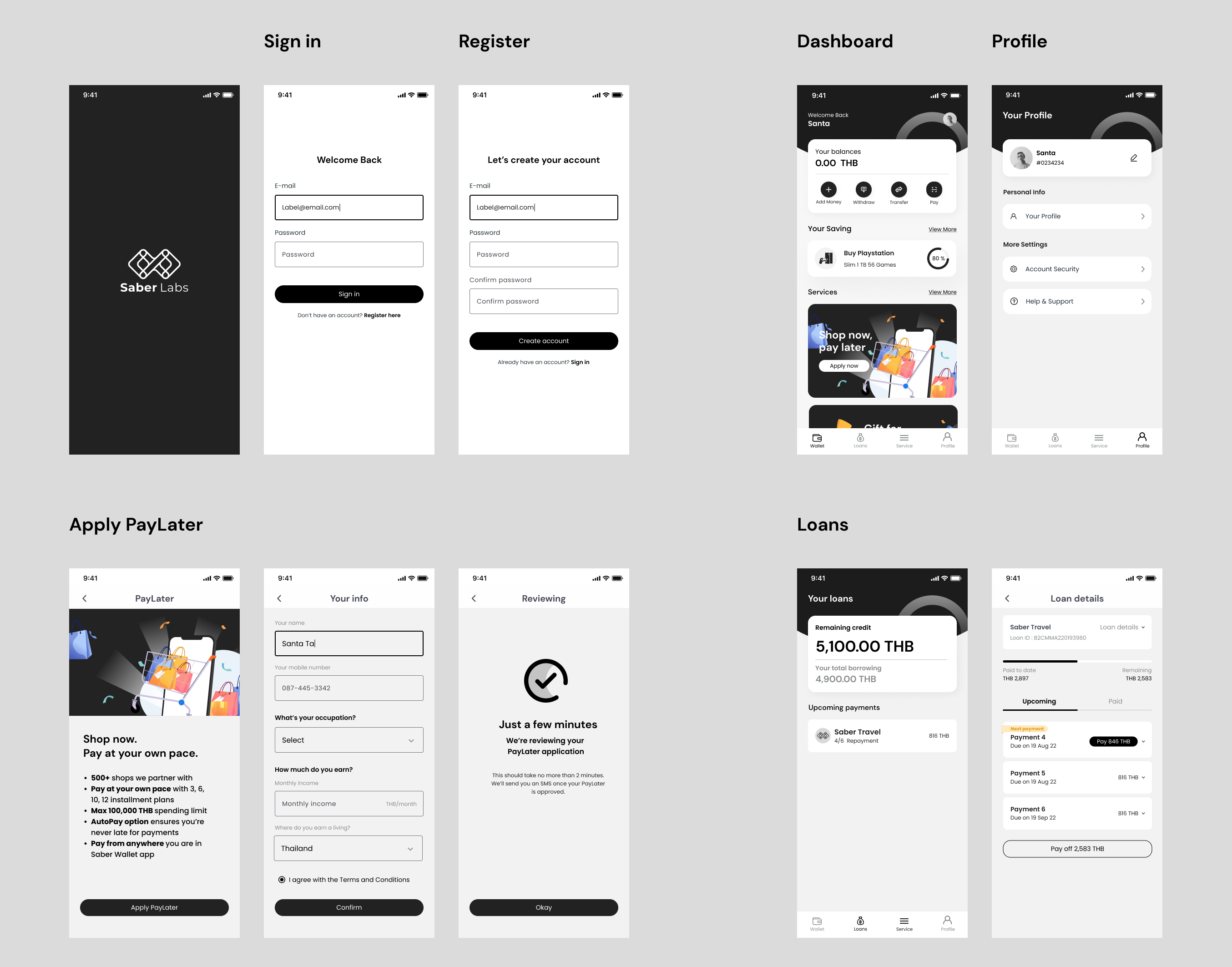
BNPL Application

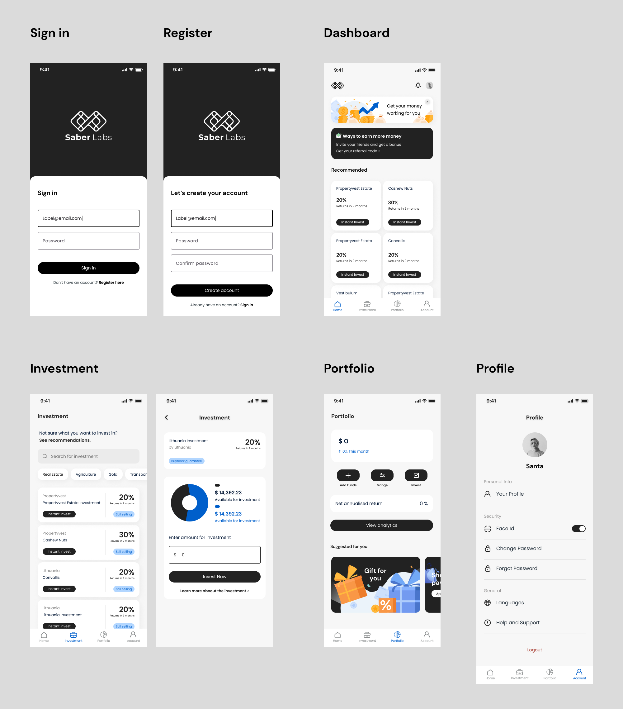
Investment Application

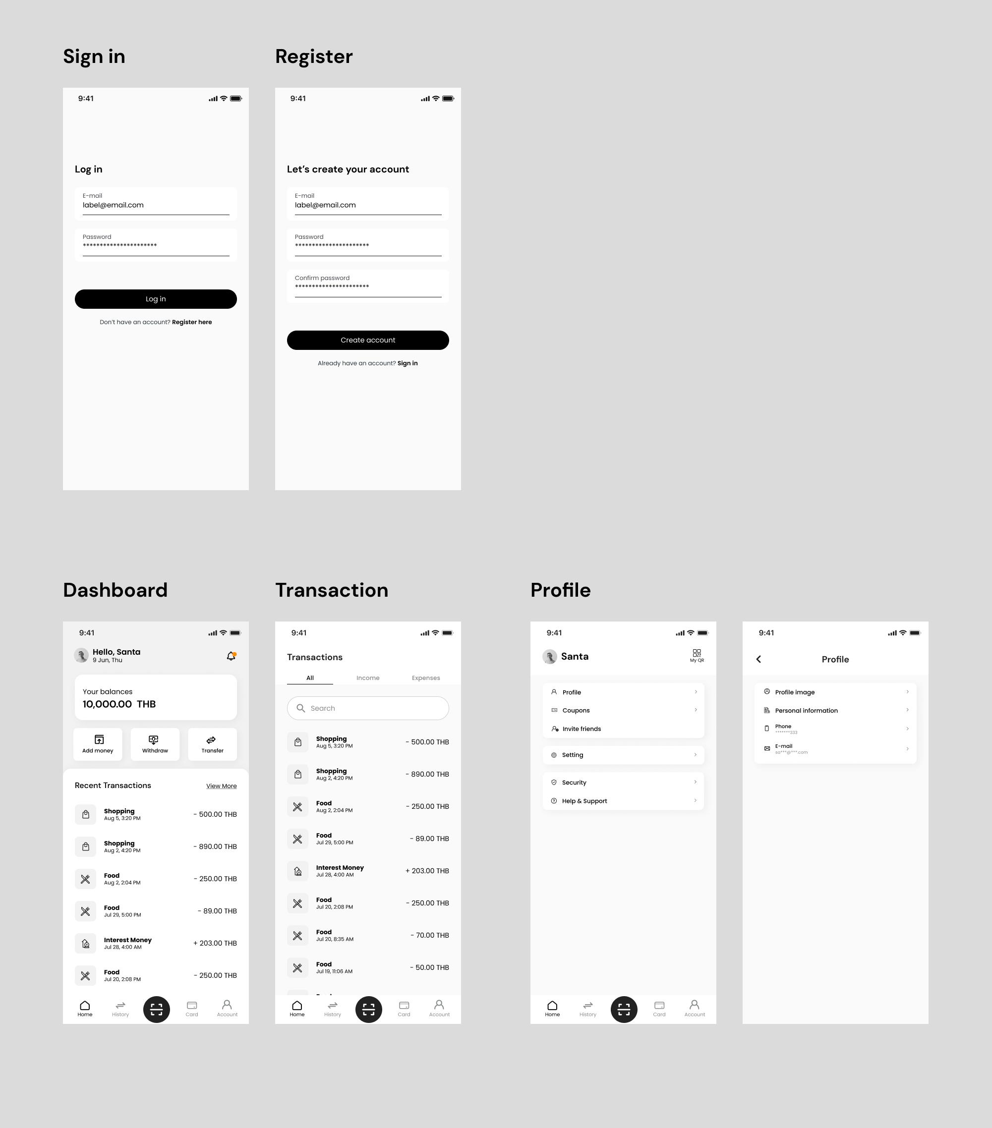
Wallet Application

So far, the solution has proved its usefulness by being used on multiple occasions.
We started using it in the Innovation Team when there is a new initiative that requires building applications. As a result, the time for creating a new app page is substantially decreased compared to the previous application development.
We are honored to participate in SCB’s Innovation Bootcamp Program which gathered talents from SCB and subsidiaries aiming to pinpoint and solve existing problems or improve processes with technology. Our team presented the UI components solution and run through the demo to demonstrate how the solution works and helps reduce the time to deliver.
It was introduced for use in SCB TechX’s Internal Hackathon 2022 and for bootstrapping from a Figma prototype to an interactive app.
After being tested in many uses, there is still lots of room for improvement, for instance, the documentation that could be more visual and interactive, like Flutter’s documentation, or continuous build and deployment pipeline for the documentation and examples as well as the library itself.
Technology and Framework
- Material Design - an adaptable system of guidelines, components, and tools that support the best practices of user interface design.
- Flutter - an open-source framework by Google for building beautiful, natively compiled, multi-platform applications from a single codebase.
- Docusaurus - Open Source project by Meta for building documentation website
- AWS Amplify - AWS cloud service for hosting the documentation website
Appendix
- Documentation - Hello from Saber Flutter UI (Beta) | Saber Flutter UI (Beta)
- Source code available on GitHub